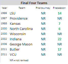
The Final Four: Preseason AP Poll Accuracy

A recent blog post by Ken Pomeroy got me thinking about the preseason AP college basketball poll.

Clicking some of the links within the post made it apparent that, despite having never seen the teams play a real game, the AP voters have been fairly consistent in predicting future success.

As mentioned in this post, once the regular season begins, most AP voters tend to follow an unwritten set of rules (ex. If you lose, you drop. If you win, you move up).

However, in the preseason there isn’t much outside pressure and each voter is able to rank the teams in an organic way. While voters may have a couple of sleeper teams in their top 25, once the ballots are combined it provides a fairly accurate projection…

“The end result is that it provides a better picture of the state of college hoops before the season begins than any single person or algorithm could produce. It’s informed groupthink at its finest.”

Also from the blog post: The preseason #1 has made it to the title game a total of 10 times compared to just six for the final #1.

After looking at the results, of the nine Final Four teams that were unranked in the pre-tournament poll since 1986, five of them were ranked in the preseason poll. (I originally saw ten pre-tourney unranked teams, but received a correction from Pomeroy himself. I’ll blame that on the V-lookup).

Preseason AP poll accuracy

By simply adding up the numerical rankings of the teams who have made the Final Four (in the preseason and pre-tournament polls), you’re able to compare the accuracy. The chart below contains data from 1969-2011, separated into four-year segments.

The preseason poll is worse, but not by much. Especially in the last fours years.
Preseason AP College Basketball Poll Performance

Analyzing the NCAA Tournament Elite Eight (2007-2012)

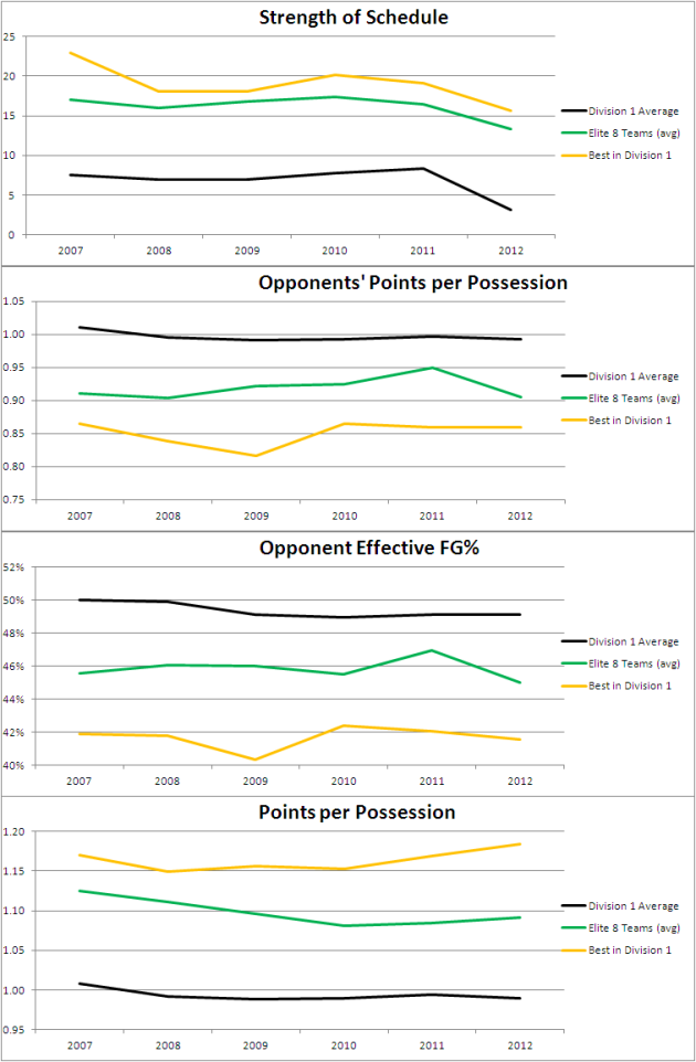
The charts below contain regular season stats, segmented by Division 1 average, Division 1 Best and the Elite Eight teams for the given year.

Annually, the teams in the Elite Eight have high Strength of Schedule numbers. This is not surprising. Of the 48 Elite Eight teams in the last six  years, only seven of them (15%) have been from “mid-major” conferences.

Last year’s Elite Eight had some of the poorest defensive metrics of any year.

Compared to 2011, this year’s Elite Eight has a better Offensive Efficiency (points per possession), Defensive Efficiency and Opponent eFG%.

NCAA Elite Eight stats by year (2007-2012)

Rick Barnes Coaching Tree: Reg Season vs. NCAA’s

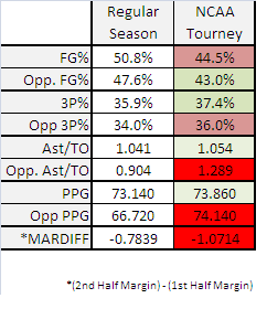
The following chart shows collective data from coaches in the Rick Barnes coaching tree 2007- 2010. These are former Barnes’ assistants that went on to coach their own teams. It’s separated by Regular Season vs. NCAA Tournament. Performance seems to drop off significantly in the tournament.

Not every coach registered NCAA Tournament data and the chart does not include games from the 2012 tournament (even though they would prove my point even more).

Coaches included: Rick Barnes (Texas; ’07-’12), Ken McDonald (W. Kentucky; ’07-’11), Frank Haith (Miami; ’07-’11/Missouri; ’11-’12), Dennis Felton (Georgia; ’07-’08), Larry Shyatt (Wyoming; ’11).

Rick Barnes coaching tree

Texas vs. Cincinnati – Deja Vu

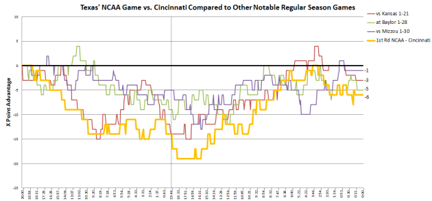
While watching the ending to the Texas/Cincinnati NCAA tournament game, it felt like deja vu. Because it was. In other big games this season, Texas’ deficit followed a similar course.

This is game-flow data (moving left to right) compared to the advantage/deficit in points at a particular time during the game.

Texas' NCAA Game vs. Cincinnati Compared to Other Notable Regular Season Games

Gonzaga’s Win Over West Virginia was Odd

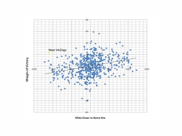
I’ve posted this chart before, but added the result from Gonzaga’s win over W. Virginia in the first round of the 2012 NCAA tournament on Thursday.

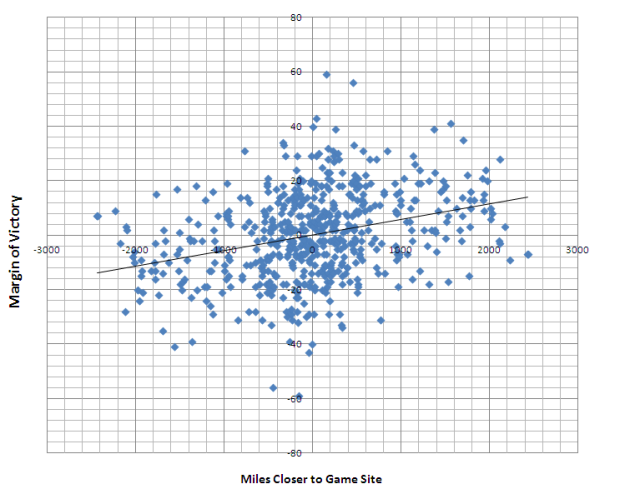
The game in Pittsburgh required Gonzaga to travel 2,200 more miles than W. Virginia, who took an hour-long bus ride to the game.

Based on historical data, Gonzaga shouldn’t have won by 22 points.

20120315-210636.jpg

Halftime Adjustments in NCAA Tournament

In the NCAA tournament, teams face unfamiliar opponents outside of conference familiarity. Often times, teams struggle in the first half. But for some teams, the coaching adjustments prove to be the difference.

The chart below shows first half scoring margin (blue) vs. second half margin less first half margin (red). For instance, on average Tom Izzo find himself down by 4 points at halftime and then outscores the opponent by 13 in the second half. Red = (13-4) – 4

DATA: last 5 years; minimum three games; take out first round results (sub-par competition)

Victory Margin vs. Diff. In Proximity

The chart below shows why most coaches would rather be a #2 seed close to home than a traveling #1 seed. This data is for ANY team/seed, regardless of who’s favored.

Victory Margin vs. Diff in Proximity

Cinderella Plot

Check out this graphical representation of how busted each year’s bracket has been. 2011 was fun.

Courtesy of @teamrankingsCBB and @statsinthewild.